| 08/22/23, 03:32 PM | #1 | |
|
Join Date: Nov 2020
Posts: 15
|
Master Merchant, not sure if I did the refresh right
I followed the instructions for the refresh however the graphs look really weird and spread out to the point that they really cant be followed even for commonly traded items. Another thing that can be noticed is that there are often flat lines that appear on certain levels on the graph. I must have done something wrong. If anyone had a idea of what that is it would be super helpful.
below is a screenshot taken of the issue, also attached is a zoomed in view that hopefully helps. https://steamuserimages-a.akamaihd.n...etterbox=false below this is how it used to look https://esouimods.github.io/img/example_4_plating.jpg Last edited by Lucinator : 08/22/23 at 05:33 PM. |
|

|
| 08/22/23, 04:24 PM | #2 | ||
Join Date: Mar 2021
Posts: 31
|
 |
||
|
|

| 08/22/23, 04:48 PM | #3 | |
|
Join Date: Nov 2020
Posts: 15
|
I know, I do that so I can get a spot price for the 30 days while using MM for my yearly trend. Still doesnt explain why the graph is so weird (MM graph only)
|
|
|
|
| 08/22/23, 06:02 PM | #4 |
|
What does the same item look like with trimming outliers off?
The data for each item varies and values are not symmetrically distributed around the mean. This is why the standard deviation may be different than someone might expect. The graph reflects the variability in each items sales pattern, regardless of whether it conforms to your personal preference. It isn't really possible to improve that, especially when the data does not follow a symmetric distribution. Last edited by Sharlikran : 08/22/23 at 11:44 PM. |
|
|
|

| 08/23/23, 05:18 PM | #5 | |
|
Join Date: Nov 2020
Posts: 15
|
Here is the screenshot
https://steamcommunity.com/sharedfil...?id=3024785646 As for whats going on I still dont know, The graphs used to look like the second image I posted in the OP, including for Ruby Ash, I could then follow price trends. there would be a obvious trend line/wave, now its all noise PS anyway to add a mean line? Last edited by Lucinator : 08/23/23 at 05:22 PM. |
|
|
|
| 08/23/23, 07:20 PM | #6 | |
|
||
|
|
| 08/23/23, 07:54 PM | #7 | |
Please take some time to use some common sense and simply observe your data from the guilds you are in. There may be some things you can do with real world applications of data like SAT scores for high school students to explain why there is a drop in their SAT scores compared to last year. This is ESO and people just sell stuff to make gold. The screen shot for the plating from my documentation was from September 2021. So at that time the data I had in my LibHistoire file produced that scatter plot. I have no control over what people sell things for currently. Example #1  There is no way to draw the majority of the 2853 sales from that graph with any kind of normality whatsoever. The range of the highest to lowest price is 1 to 340 and the scale of the dots produces the results you are seeing. This is a perfect example of expected behavior based on the prices over one year with the data you have. Especially with the outliers I circled. Example #2  With this scatter plot it's pretty obvious to me that the data from the guilds you are in, everyone sells things between 40 and 63 gold per, hoping someone will buy it. That's also pretty easy to deduce from that scatter plot. There should be no surprises here either and this is also expected based on your data you have collected from the guilds you are in. Example #3  This image is with outliers trimming off. I am a victim of the same situation as you. There are going to be people that will intentionally list things and either buy it from themselves on another account or work with someone to do so. This is also expected behavior on the part of certain individuals that I have no control over. Example #4  This image has trimming outliers on and the data for this item is the only one I have that has any kind of normality to it. Again I can't control that. Example #5  For this image I had to right click the dots and add 25 people to the Guild and Account filter to make it look like that. What I see is that the mean with no outliers is 131 and the mean with all my adjustments is 116. However the graph shows the average for 90 days and the average has been lower in the past. Example #6  The ten day average is 182 and that aligns with the previous graph with the high price being 180. Which is also somewhere between the 169 and 206 values from TTC. I really encourage you to reduce the amount of data you store. You don't need to be the library of congress of data. I can do all of what I just did with only MM and using the focus keys. Because of the default view you have basically 4 ways to show data. I can show 90 days for the default, then 5, 10 and 30 if I choose. Just holding shift, ctrl or both will give me all the data I need. I have the truncated TTC averages there as well. Example #7  For this image I ran around to the traders in the city I was in at the moment and talked to the banker. The Bonanza average is 211 after adding people selling Platinum Ounces for more then 300 gold. Because again people love to list things for 3 to 9 times the amount to artificially drive prices up. With 74 listings after trimming outliers the Bonanza average is 211. Which is close to what I mentioned from TTC. So anything selling between 180 to 210 is probably reasonable and not an inflated price. It took me longer to get the screen shots and make this post then it took me to observe the data. It took me longer to get the Bonanza data then I needed. I could have done the same with probably just the guilds I am in. Which further illustrates that it is simply unnecessary to be the library of congress of data, completely unnecessary to export data from MM although it's an option, and completely unnecessary to add all your exported data to spreadsheets to draw pretty lines. I was able to figure out a reasonable price was 180 to 210 with only the MM UI, without a year of data, without other trading mods, and only in game data in a matter of minutes. Not the hour that it took me to put this post together. Example #8 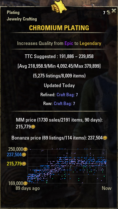 This image is from September of 2021 that I put in my documentation. Example #9  This image is MM version 3.7.67 with the same current data I have. Example #10  Current version outliers off. Example #11  Current version trim outer percent set to 5%. Example #12  Current version trim outliers Example #13  Current version trim outliers with more aggressive boundaries. Summary As I already explained. Nothing changed. Update 39 did not cause anything to change. The updates to the versions did not cause anything to change. It is a complete waste of your time and mine to discuss this. Comparing the prices to September 2021 to now is useless. People are posting things at any price they can get people to buy the item for. People post with any price that will intentionally pollute MM and TTC data and then they buy and sell to themselves or work with other people to artificially skew prices. If you want that to change, then post on the official forums and see what kind of feedback you get. I don't feel you will get any useful feedback if they don't flat out laugh at you. However, feel free to do so if you choose. The graph functionality has not changed, how people price things has changed. I have no control over that and I'm completely disinterested in worrying about it because I have no control over what people do. You don't either, so unlike the movie Frozen... let it go. As for the rest... I can't help you with something I can't control. If you want to express your concerns over how people list items the official ESO forums would be a great place. Some people may agree with you and you could get some empathetic feedback. In the end I don't think any post you make will change the situation. In my opinion we are on the cusp of price gouging and price controlling unlike we have seen in the past. The values of crowns per gold for selling crowns is on the rise and the fact ZOS doesn't control that has an impact on the amount of gold in circulation. Especially whey there are middlemen that receive a portion of the transaction. For doing basically nothing but brokering a possible secure transaction. Trader competition and guilds using multiple accounts to bid on multiple Kiosks to eliminate competition is also a factor. The only way any of that will change is if ZOS comes up with an idea to cull that kind of behavior. Which I don't see them doing. So thanks for the question, it isn't anything I can control and the data you have is just data and the graph just represents the data you have collected. Last edited by Sharlikran : 08/24/23 at 07:47 PM. |
||
|
|
| 08/24/23, 03:18 PM | #8 | |
|
Join Date: Nov 2020
Posts: 15
|
I fully understand all of what you have just said, but I think you missed what I was asking. What I was saying was that prior to your last update when I looked at the same item (ruby ash for example) it showed a nice tight band that showed pretty clearly how the price had behaved over the last year. Now it doesn't. The data should be the same so why does it look different from what it did before your U39 update.
|
|
|
|
| 08/24/23, 04:06 PM | #9 |
|
Did you check all of your settings for MM and LibGuildStore? Settings got changed back to default. You may need to fiddle with them again.
|
|
|
|

| 08/24/23, 07:54 PM | #10 |
|
Lucinator I understood exactly what you were asking and I already answered it. I spent about an hour today and yesterday. I do not have the time to invest in the question. As I explained I have no control over what people do when they intentionally skew prices. Read my updated post. I have all the images marked with "Example #x". Each example shown has an explanation below it. Please note I used version 3.7.67 prior to update 39 and the current version.
Example #8 looks the way it does because there weren't as many idiots posting at stupid prices. There is nothing I can do about how examples 9 through 13 look. As I have suggested in my updated post if you want to complain to the masses, go ahead. It won't get you anywhere but feel free to do so if you chose. I can't help you. The graph functions as intended with the given data. The massive line in Example #1 is that way because of the outlier at 340 gold. The outliers in example #3 and #10, same thing. I can't make the graph look less crappy just because you want it to look prettier. Last edited by Sharlikran : 08/24/23 at 07:59 PM. |
|
|
|
| 08/27/23, 05:35 PM | #11 | |
|
Join Date: Nov 2020
Posts: 15
|
then let me replay with the simplest language I can. Why does the same data set show such a difference in graph displays between your updates. The data did not change, this is NOT due to how people are listing bad prices, it is due to how that same data is being displayed, A year of data is not gonna show as completely different in two days. The only thing that could have changed is either a setting or something in how the addon interprets/displays it, ie how it decides on scale and so forth. Which I believe to be the problem. I compared my ATT graph to one of MM using the same time scale and the one from ATT is much easier to read trends with. Is there any way to adjust how the add-on determines scale?
Last edited by Lucinator : 08/27/23 at 06:29 PM. |
|
|
|
| 08/27/23, 08:49 PM | #12 | |
|
Attention!
 Everyone, it's too hard for me to understand complex words and sentences. For example, if someone were to say to me, "Spare me the incredulity Sharlikran. I have no equanimity for your inequitable conduct." There is no way I'm going to understand that. It's just too complex, I need everything in simplest terms.
Last edited by Sharlikran : 08/27/23 at 11:18 PM. |
||
|
|
| 08/27/23, 09:00 PM | #13 |
|
Example #14, similar to Example #9
 Similar to Example #9 this is version 3.7.67 which is the previous version before any changes. Which I have mentioned I have not changed anything related to how the graph is drawn. Just the outliers options. I have been messing with stuff so much I didn't notice I'm at 60 days and not 90. So this is a 60 day graph. Example #15, similar to Example #12  Similar to Example #12 this is the same data using 3.7.79 with only the trim outliers option enabled. Again a 60 day graph. Example #16  I don't have 30 days of data for ATT so instead I reset LibHistorie and started with all new data for MM and ATT, fresh files, all 100% brand new... and you mean to tell me that the ATT graph looks better then MM?  Is it the amount of squares? Last edited by Sharlikran : 08/27/23 at 09:03 PM. |
|
|
|
| 08/27/23, 09:10 PM | #14 |
|
I don't think you noticed I used the same data for Example #9 with version 3.7.67 and the same data for Example #12 with the current version at that time. The graph is not drawn any better between the two versions, at all. Nor is there any difference in how the exact same data is drawn between ATT and MM. Which to get that you have to have outlier trimming disabled for MM.
Today was a good day to update my data and make backups. So I made new 60 day graphs. Example #14 and Example #15 look nearly identical. I don't see how 3.7.67 is drastically drawing the graph better when using the same data. As I already explained, the graph is simply a dot within a square and where the dot is placed is based on the data the user has. If your data makes the graph look terrible and my data makes the graph look terrible, then that's how it looks based on the pricing of the sales data. If someone in another guild has better looking graphs then their prices are simply different and it just happens to look better. If it looked better in Sepetmeber of 2021 then yes, the pricing data at that time made it look exactly like it shows in my documentation for that time when that screenshot was taken. Last edited by Sharlikran : 08/27/23 at 09:30 PM. |
|
|
|
| 08/27/23, 10:59 PM | #15 |
|
Example #17
 Current version at 90 days again, without ignoring outliers. I bet that person that sold that for 494 gold has regretted that ever since. Example #18  Adding only the one seller for 494g to the Guild & Account filter gave me this graph without ignoring outliers. On the off chance that you say that's better then you should probably read the documentation and check your settings. Because if you tell me that Example 17 and 18 look fine then just read the settings tooltips and change it however you want. You can filter any sellers using the Guild & Account filter. And no whatever has been said by other people, no settings were suddenly reset. During a full reset I noticed recently that the days for retention plus the min and max settings change but that was intentional previously when upgrading from 3.5.x to 3.6.x. However, that's no longer needed. The next version will use the max value for the three settings mentioned again one more time just so that the tracking variable can be set. After that it won't happen again even on a full reset. That's to address something mentioned by another user that wants their days for retention to be 15 and hasn't been able to get it to stay that way with the current version. Last edited by Sharlikran : 08/27/23 at 11:13 PM. |
|
|
|
| 08/28/23, 02:05 AM | #16 |
|
The best analogy for what you are trying to get me to do is this. You watched some videos by Neil deGrasse Tyson and in the videos he gave you examples for how he knows that the world is round. Even though he has not been to outer space and neither have you. His explanation defines how it would be simply impossible that the world is flat.
You contact him like you are contacting me and tell him to make you an equation that shows the world is in fact flat. Not because it's flat, but because you like that idea better. Last edited by Sharlikran : 08/28/23 at 02:16 AM. |
|
|
|
| 08/29/23, 12:46 PM | #17 | ||
|
Join Date: Nov 2020
Posts: 15
|
|
||
|
|
| 08/29/23, 02:58 PM | #18 | |
 Example #19  Example #20  I have been patient and respectful and you have wasted my time with your rhetoric. I have not ignored the question. I have shown examples of how MM draws the graph differently with and without ignoring outliers. I have explained that the Y axis is based on the low and high price of the sales for the item. How the graph is scaled is based on that and I circled some examples for the image Example #1 that you provided to explain why the graph won't draw differently. I have also provided examples and I provide documentation on how to add people that skew prices to the Guild and Account filter. I have mentioned that the graph will only look pretty if the sales are priced in such a way that it will look nice as shown in Example #19 and Example #8.
Last edited by Sharlikran : 08/29/23 at 08:45 PM. |
||
|
|
| 08/29/23, 04:54 PM | #19 |
|
I've watched this thread and would like to say:
I for myself am not trading enough to follow all but so far I was able to at least understand the explanations that Sharlikran provided, together with the screenshots. Please all stay focused on the details, read the explanations and if something is not working as expected provide an example, so one can rebuild it. Saying A does not work like B, or A is not as good as B is not helping. Provide details, ways to reproduce, screenshots e.g. to compare it properly, visually. If this thread here will result in a "fight", it will be closed. Thanks for your understanding |
|
|
|

| 08/30/23, 08:35 PM | #20 | ||
|
One of my peers gave me some valid feedback. However, I don't see any way to answer the question. The scale is based on the low and high price of all the valid sales.
For MM valid sales are first filtered by the Guild and Account filter, then outliers are removed if the option is enabled. A basic example is prices = { 1, 300, 200, 150, 340 } Like Example #1 that basic example the lowest price is 1 and the highest price is 340. Each dot is drawn with one scale. The graph cannot be drawn where only certain dots are drawn at one scale and others with a different scale. That wouldn't work in the real world with a scatter plot. I wouldn't know how to do this on a TI-80 but I doubt it can use two different scales and if it did then the largest scale would push all the other dots down just like in game. The desired outcome of the OP is not achievable. In a real world scenario scientists would remove the outliers and then examine the data. If the outliers were not longer skewing the data then they could explain the outliers and the results. If the outliers were removed and the data still did not make sense then the scientists would explain what may have went wrong with the experiment. Then try again. That isn't applicable here. You can't do weird math and customize that math to each item in game to produce pretty graphs. You can't make dots conform to personal preferences. You can only get the low and high prices, the day range, and then calculate the coordinates for each dot. I will show what it looks like to Intentionally skew the graph with the following examples. Example #21 - Before Skewing Prices Added
Warning: Spoiler
 Example #22 - After Skewing Prices Added
Warning: Spoiler

Which is why in the before picture you see 12 dots with different Y coordinates, and the after picture with the sales of 500, 1000, 1200, 1500, 2000, 2500 all pushing the sales down to the bottom because the highest price is now 2500. This is what is happening with the OPs initial screenshot Example #1 with the low price of 1 and the high price of 340. Only MM has features to resolve the issue. 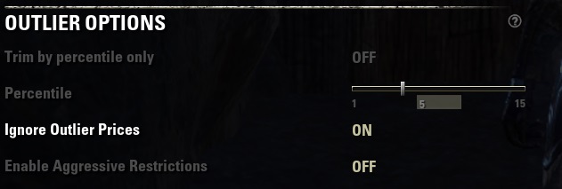 For this example trimming by the outer percentile did not eliminate the outliers very well because there are only a few sales and even at 15% which is 15% - 85% it wasn't enough. The standard method of trimming outliers wasn't sufficient for this example either but it may be for most cases. I was able to get the graph back to having a high price of 250 enabling Aggressive Restrictions. The sales data is different for each item. No outlier routine will accommodate all items in all cases. Some of the intentional price skewing happens over time and the skewed prices are now part of the standard devation so they are included in the mean. The other way to accomplish this if you don't want to trim outliers is to add the seller to the Guild and account filter and that will produce the results shown in Example #23 below. Example #23
Warning: Spoiler
 Last edited by Sharlikran : 08/31/23 at 08:54 PM. |
|||
|
|
| ESOUI » AddOns » AddOn Help/Support » Master Merchant, not sure if I did the refresh right |
«
Previous Thread
|
Next Thread
»
|
| Display Modes |
 Linear Mode Linear Mode |
 Switch to Hybrid Mode Switch to Hybrid Mode |
 Switch to Threaded Mode Switch to Threaded Mode |
|
|

AddOn Sites
© 2014 - 2022 MMOUI
vBulletin © 2024, Jelsoft Enterprises Ltd